
Field Service Dashboards: 5 Views to Stop Revenue Loss for Ops Leaders
Field Service Dashboards: 5 Views to Stop Revenue Loss for Ops Leaders
A field service dashboard is a live operations control panel that shows the KPIs you need to act now, so you can stop firefighting and start preventing revenue loss. It replaces the end-of-week spreadsheet with something dispatchers, technicians, and finance leads can all watch in real time. The roles that benefit most are the ones closest to the money: dispatch, operations management, and accounts receivable.
TL;DR:
- Dashboards should focus on real-time KPIs that trigger action, such as SLA breaches and unpaid invoices, rather than static or vanity metrics.
- Building role-specific dashboards with drill-downs helps decision-makers quickly identify underlying issues and take immediate corrective steps.
- Visual emphasis should align with decision importance, using threshold colors and simple tiles to rapidly convey the severity of operational exceptions.
- Effective dashboards start small, prove their value in one area like collections or SLA compliance, then expand gradually across teams and locations.
- Superior dashboards incorporate native data integrations, standardized KPI definitions, and strict governance to support scalability and trust over time.
Table of Contents
- What Makes a Field Service Dashboard Different From a Report
- What Dashboard Types Should You Build, and What KPIs Belong on Each?
- How Should Dashboards Differ Across Ops, Dispatch, Finance, and Field Techs?
- Dashboard Features That Actually Speed Up Decisions
- Why Vanity Metrics Sneak Into Field Service Dashboards
- How JobOS Pro Puts These Practices Into Practice
- Building for What Your Field Service Business Will Need Next Year
- What Successful Field Service Dashboard Rollouts Have in Common
- The Real Problem With Most Field Service Dashboards
- See These Dashboard Practices in a Live Field Service Platform
- Sources
What Makes a Field Service Dashboard Different From a Report
A static report tells you what happened last week. A field service dashboard tells you what’s happening right now, and lets you do something about it before the job goes sideways. That’s the core distinction operations managers need to internalize: reports are retrospective, dashboards are operational. Oracle’s own field service documentation describes this shift directly. Dashboards display real-time reports in charts that show resource status and let managers track mobile worker productivity by work type as it unfolds, not after the fact.
That real-time layer is what turns a tile from decoration into a decision trigger. When a technician’s ETA slips, or a batch of invoices ages past 30 days, the dashboard surfaces the exception the moment it forms, letting a dispatcher reroute or a finance lead trigger a collections call within minutes instead of days.
Leaders typically measure success across three outcome categories:
- SLA attainment, tracked as a live percentage rather than a monthly summary
- Days sales outstanding (DSO), watched daily to catch collection slippage early
- Technician utilization, compared across crews or regions to spot capacity gaps
What Dashboard Types Should You Build, and What KPIs Belong on Each?
Most field service organizations need five distinct dashboard views, not one master screen trying to do everything. Each view exists to answer a different question for a different audience.
- Operations overview. Jobs by status, SLA breaches, backlog volume, and daily throughput. This is the screen a service director checks first thing every morning.
- Scheduling and dispatch board. Technician location, live ETA, unassigned jobs, and schedule pressure by zone. Dispatchers live here all day.
- Technician mobile view. Today’s job list, next job details, timesheet status, and required checklists. Built for a phone screen, not a desktop.
- Finance and revenue dashboard. Outstanding invoices, DSO, quote conversion rate, and average ticket size.
- SLA and compliance dashboard. SLA attainment by contract, overdue preventive maintenance (PPM), and safety check completion.
Operational KPIs should include throughput, backlog, SLA attainment, exception volume, cycle time, and capacity so bottlenecks are easy to spot instead of buried in a spreadsheet pivot table.
Pro Tip: Don’t build the finance dashboard as an afterthought. Unpaid invoices and slow quote follow-up are two of the most common places field service revenue quietly disappears, and a dedicated view catches both faster than a shared operations screen ever will.
How Should Dashboards Differ Across Ops, Dispatch, Finance, and Field Techs?
Every role needs a different subset of the same underlying data, filtered and prioritized for what that person actually decides on. A dispatcher doesn’t need DSO trends. A finance lead doesn’t need technician GPS pins. Design each view around the two or three decisions that role makes every day, then build tiles that support exactly those decisions.
A workable structure looks like this:
- Operations leaders get a single screen with SLA attainment, backlog, and exception counts at the top, filterable by region or team.
- Dispatchers get a live map with technician location, unassigned job counts, and schedule pressure, filtered by zone.
- Finance leads get outstanding invoices, DSO, and quote conversion, filtered by branch or franchise location.
- Field technicians get a mobile view limited to today’s jobs, the next job’s details, and timesheet status.
Drilldowns matter as much as the top-line tile. A KPI number with no path to the underlying record is a dead end. Clicking an SLA breach tile should open the specific work order behind it; clicking an outstanding-invoice figure should open that invoice, not a generic report. Prebuilt field service analytics templates increasingly build this in by default, with drill-downs to jobs and work orders baked into the KPI tiles themselves rather than added later.
Dashboard Features That Actually Speed Up Decisions
Not every metric deserves the same visual treatment. Big-number tiles work for a single figure someone needs to see instantly, like today’s SLA attainment percentage. Trend charts work when the question is “is this getting better or worse,” like weekly backlog volume. Maps work when location matters more than the number itself, like technician position or job density by zip code.
Threshold colors need discipline or they become noise. Green, yellow, and red should map to specific, documented triggers, not a manager’s gut feeling that day.
- Green means SLA attainment above 95%, no action needed.
- Yellow means 85 to 95%, worth a check during the next review.
- Red means below 85%, requiring same-day escalation.
Wallboard or TV mode works well for shared team spaces, showing three to five tiles at most so nobody has to squint to catch the number that matters. Mobile views should strip everything down to what a technician needs between jobs. Export options matter for finance teams that still need a CSV for month-end reconciliation, even in a real-time environment.
Why Vanity Metrics Sneak Into Field Service Dashboards
Vanity metrics survive because they’re easy to pull and look good in a meeting, not because anyone actually uses them to decide something. Total calls answered, app logins, or cumulative jobs completed since launch all fall into this trap. They climb steadily, they never look bad, and they never drive a single action.
Two rules fix most of this. First, every metric on a dashboard has to tie to a specific decision someone makes with it. Second, cap the number of tiles per screen. Klipfolio’s guidance on operational dashboards is blunt about this: leaders should choose metrics that link to strategic goals, because metrics that don’t influence a daily decision quietly turn into noise nobody questions.
- Assign a named owner to every KPI on the dashboard.
- Document the exact definition and calculation for each metric.
- Set an update cadence and stick to it.
Pro Tip: Ask every metric one question before it earns a spot on the dashboard: “What would someone do differently tomorrow if this number changed?” If nobody can answer, cut it.
How JobOS Pro Puts These Practices Into Practice
JobOS Pro was built around exactly this operational-first philosophy: dashboards that surface a revenue leak the moment it happens, not a summary of leaks that already cost you money. Its AI-native operational intelligence connects work orders, invoicing, scheduling, and telephony into one live view, so missed calls, unpaid invoices, and scheduling delays show up as exceptions instead of buried line items.
For franchise operators, the same multi-location intelligence lets corporate leadership benchmark performance across sites and standardize what’s actually working, rather than guessing from disconnected reports. JobOS Pro’s research into revenue leakage across a large sample of home service transactions grounds these dashboard recommendations in real operational data, not theory.
Before any demo, verify these items:
- Which data sources connect natively (scheduling, invoicing, telephony, GPS)
- Which KPIs come prebuilt versus require custom setup
- What success metrics the vendor expects you to hit in 90 days
Building for What Your Field Service Business Will Need Next Year
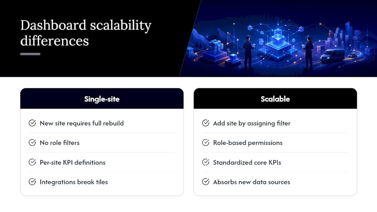
A dashboard built for a ten-technician operation breaks the moment you add a second location, a new service line, or a franchise partner. Scalability has to be a design decision made early, not a rebuild forced later.
The practical test is whether a dashboard can absorb a new site, technician role, or KPI without a rebuild from scratch. Role-based permission structures solve part of this: if your dashboard architecture already filters by team, site, and region, adding a fourth location means assigning a filter, not redesigning the screen. Franchise operators feel this acutely. A dashboard that only works for a single location forces every new site to start its reporting from zero, which slows onboarding and makes performance comparisons unreliable.
Customization needs limits too. Letting every branch manager build their own tile layout sounds flexible until leadership tries to compare performance across ten locations using ten different metric definitions. The better approach standardizes the core KPI set across every site (SLA attainment, DSO, utilization, backlog) while allowing secondary tiles to flex by local need, like weather-driven demand for HVAC crews versus recurring-contract volume for pest control routes.
Integration flexibility matters just as much as visual flexibility. As a field service business adds tools, whether a new accounting platform, a marketing automation system, or a franchise management layer, the dashboard needs to absorb new data sources without breaking existing tiles. Rebuilding metric definitions from scratch every time you add a tool is the clearest sign a dashboard wasn’t designed to scale in the first place.
What Successful Field Service Dashboard Rollouts Have in Common
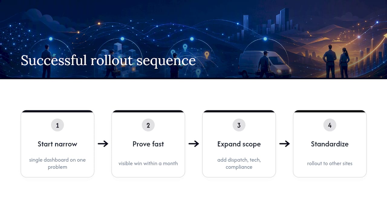
The pattern across effective rollouts is consistent: they start narrow, prove value fast, then expand. A common sequence looks like this. An operations team launches a single dashboard focused on one painful problem, often unpaid invoices or missed SLA windows, rather than trying to build the full five-view suite on day one.
Within the first month, that narrow focus produces a visible win: a finance team that starts tracking DSO daily instead of monthly typically catches aging invoices weeks earlier, giving collections staff a real head start instead of a stale list. Dispatch teams that add a live technician map often see unassigned jobs resolved same-day instead of sitting overnight, simply because the gap is visible the moment it forms rather than surfacing in a next-morning report.
The rollouts that stall usually try to launch everything at once. Five dashboard types, forty KPIs, and no governance plan overwhelm both the data pipeline and the humans expected to trust it. The rollouts that succeed treat the first dashboard as a proof point, use it to build internal trust in the numbers, then expand to dispatch, technician, and compliance views once the first one is validated against real records.
Franchise networks add one more layer of proof: once a single location’s dashboard shows measurable improvement, corporate leadership has a template to standardize across every other site, turning one good rollout into a network-wide benchmark.
The Real Problem With Most Field Service Dashboards
The conventional advice on dashboards spends too much time on visualization and not enough on decision architecture. Most guides walk you through chart types and color schemes as if the hard part is making data look good. It isn’t. The hard part is deciding, in advance, which fifteen numbers actually change what someone does tomorrow, and refusing to add a sixteenth just because it’s easy to pull.
Operations leaders who get this right treat every dashboard build as a governance exercise first and a design exercise second. They name an owner for every KPI before a single tile gets built. They kill metrics that climb steadily but never trigger action, no matter how satisfying the upward trend looks in a leadership meeting.
What the data actually supports is narrower and more useful than most vendors admit: real-time visibility into SLA breaches, unpaid invoices, and technician capacity recovers more revenue than any amount of historical reporting ever will. If your dashboard doesn’t shorten the time between a problem forming and someone acting on it, it’s a report wearing a dashboard’s clothes. Start with the three or four numbers tied to real money leaking out of your operation, prove they work, then expand.
— Tarun
See These Dashboard Practices in a Live Field Service Platform
Jobospro is built for the exact gap this guide describes: most field service software shows you what happened, while Jobospro’s AI-native operating platform flags the revenue leak the moment it forms, whether that’s a missed call, an aging invoice, or a technician sitting idle in the wrong zone.
Because it connects directly to the systems you already run, including Jobber and QuickBooks, you don’t have to rip out your current stack to get real-time visibility into DSO, SLA attainment, and utilization. Franchise operators get an added layer: multi-location intelligence that lets corporate leadership benchmark every site against the same standardized KPI set, so a winning behavior at one location becomes a playbook for the whole network. If unpaid invoices are the leak costing you the most right now, JobOS Pro’s approach to cutting DSO is a practical place to see the platform in action.
If you run HVAC, plumbing, electrical, or another home service operation and want to see which of these dashboards fits your current data stack, book a demo and bring your last month of invoicing and scheduling data. It’s the fastest way to see exactly where your own leak is hiding.
Sources
Dashboards fail quietly and often, usually because nobody validated the data pipeline before launch. Here’s the sequence that prevents that.
- Klipfolio: KPI dashboard operational metrics — top 10 guidelines
- The Dashboard - Field Service (Oracle docs)
Skipping the mapping exercise in step three is the single most common cause of dashboards that leadership stops trusting within a month.